Tokyo 2020 Olympics has unveiled its four shortlisted logo designs, having whittled them down from 14,599 applications.
The designs were chosen by the Tokyo 2020 Emblems Selection Committee, after the organisers held a public competition that allowed anyone to apply.
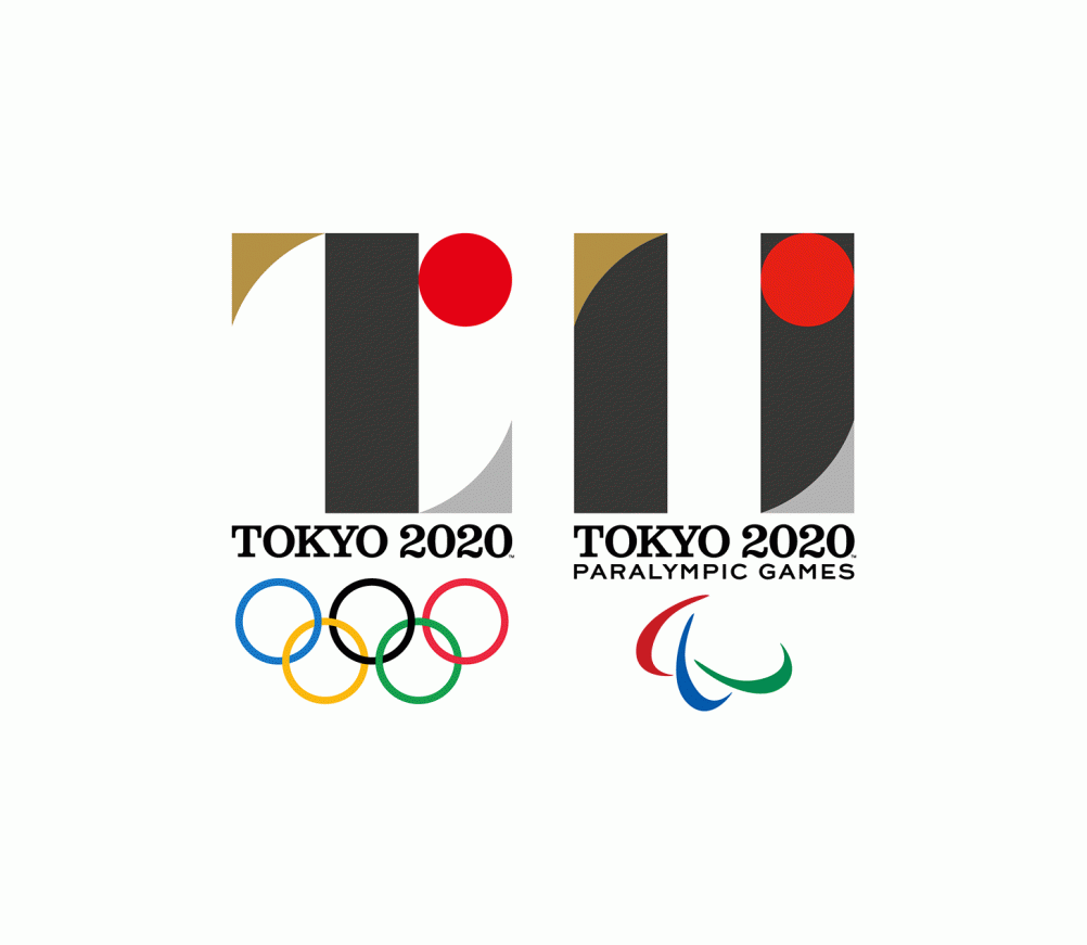
The competition came about after the original logo, designed by Kenjiro Sano, was scrapped following a plagiarism row.
The logo was pulled just five weeks after its launch, following a claim from Belgian designer Olivier Debie that it resembled an identity he had created for a theatre in Liège.
The creators of the new shortlisted designs have submitted “written pledges” to the selection committee, stating that their work is original, and have also provided documents demonstrating the design process used to make them.
“All members of the Tokyo 2020 Emblems Selection Committee are fully confident that the designs are absolutely original, and that the four shortlisted designs are the most outstanding among all entries received,” says the selection committee.
The selection committee is now asking for input from the public on which of the four designs should be chosen, and will use this in making their final decision.
The overall winner is set to be announced later in spring. The designer of the winning entry will receive a cash prize of JPY 1,000,000 (£5,500) and tickets to the opening ceremonies of the Olympic and Paralympic Games.
The four shortlisted designs are:
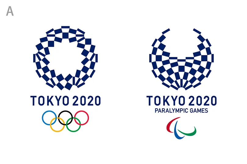
Harmonized chequered emblem
This identity aims to represent “ichimatsu moyo”, a chequered pattern used in Japan in the Edo period of 1603 – 1867. It also uses a “traditional Japanese colour” of indigo blue, which aims to symbolise “elegance and sophistication”, say the organisers.
It uses three different types of rectangular shapes, which aim to represent “different countries, cultures and ways of thinking”, and “unity in diversity”.
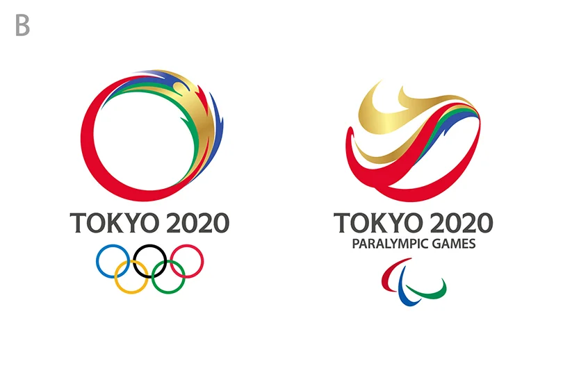
Connecting Circle, Expanding Harmony
This identity aims to represent “mental and physical strength”, and “dynamic movement and speed”, say the organisers, as well as a “connection” between athlete and spectator. It also aims to indicate “respect and warm hospitality”.
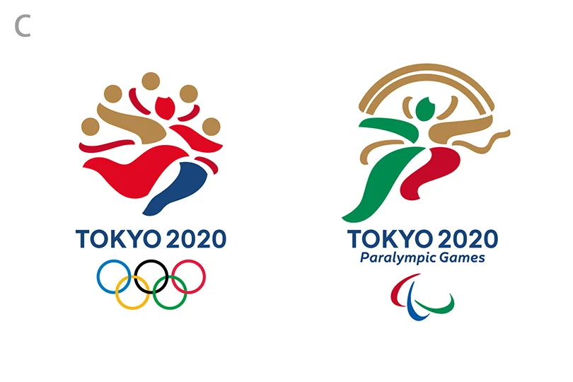
Surpassing One’s Personal Best
This identity aims to represent the Wind and Thunder Gods, which have been “much loved by the people of Japan for centuries”, says the organisers. The imagery also depicts the “instance that an athlete breaks the tape at the finish line”.
The taiko drum normally held by the Thunder God is replaced by fireworks, while the wind cloth normally held by the Wind God is replaced with a rainbow.
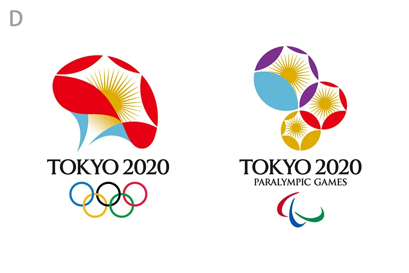
Flowering of Emotions
This aims to represent a “morning glory flower”, which was “popular during Japan’s Edo period”, says the organisers. The flower in turn symbolises “faces of athletes striving to attain a personal best” and the “bright faces of people as they applaud the athletes”.
The idea of seeds sprouting and flowers growing also aims to indicate a “sense of expectation and anticipation for the Games”.

